我们之前提到了一款可视化神器ECharts,但那是基于JS的来开发和使用的,现在我们有了pyecharts库,就可以在python中方便的调用!

1. Pyecharts 库
1.1 什么是 Pyecharts?
Pyecharts是 ECharts 的 Python 接口,通过 API 生成交互式图表

Pyecharts输出结果为HTML页面,可以方便的嵌入网站中。
Note
开发时推荐使用 Python 3.6+ 环境,低版本可能不受支持
2. 快速上手
2.1 安装
直接pip即可安装,无需其他操作
pip install pyecharts2.2 基础语法
2.2.1 基础数据格式
x轴数据:通过 .add_xaxis() 传入列表,支持数值、字符串或时间类型。
line.add_xaxis(["一月", "二月", "三月", "四月"])y轴数据:通过 .add_yaxis() 传入列表,与x轴一一对应。
line.add_yaxis("销售额", [150, 230, 224, 218])2.2.2 多系列数据
可多次调用 .add_yaxis() 添加多个数据系列:
line.add_yaxis("系列A", [10, 20, 30])
line.add_yaxis("系列B", [15, 25, 35])
2.2.3 空值处理
若数据中存在空值,用 None 占位,并设置 is_connect_nones=True 连接断点:
line.add_yaxis("数据", [10, None, 30], is_connect_nones=True)2.3 代码结构
我们在使用Pyecharts库时,一般将其划分为3个部分
1.图表部分:设置图表类型
2.数据部分:添加图表中的数据,设置数据样式
3.配置部分:添加图表标题、名称、注释、插件等
下面是一个较为完整的代码结构:
from pyecharts.charts import Line
from pyecharts import options as opts

# 1. 初始化图表对象
line = Line(init_opts=opts.InitOpts(theme="light", width="800px", height="400px"))

# 2. 添加数据
line.add_xaxis(x_data_list)  # x轴数据
line.add_yaxis(
    series_name="系列名称",
    y_axis=y_data_list,       # y轴数据
    is_smooth=True,           # 平滑曲线
    is_step=False,            # 阶梯线图
    symbol="circle",          # 数据点形状
    linestyle_opts=opts.LineStyleOpts(width=2, type_="solid")  # 线条样式
)

# 3. 全局配置
line.set_global_opts(
    title_opts=opts.TitleOpts(title="主标题", subtitle="副标题"),
    xaxis_opts=opts.AxisOpts(name="月份", axislabel_rotate=45),  # x轴标签旋转
    yaxis_opts=opts.AxisOpts(name="销售额(万元)"),
    tooltip_opts=opts.TooltipOpts(trigger="axis"),  # 提示框触发方式
    datazoom_opts=opts.DataZoomOpts(),              # 缩放组件
    toolbox_opts=opts.ToolboxOpts(is_show=True)     # 显示工具箱(保存、缩放等)
)

# 4. 生成HTML文件
line.render("line_chart.html")
2.4 一个比较完整的示例
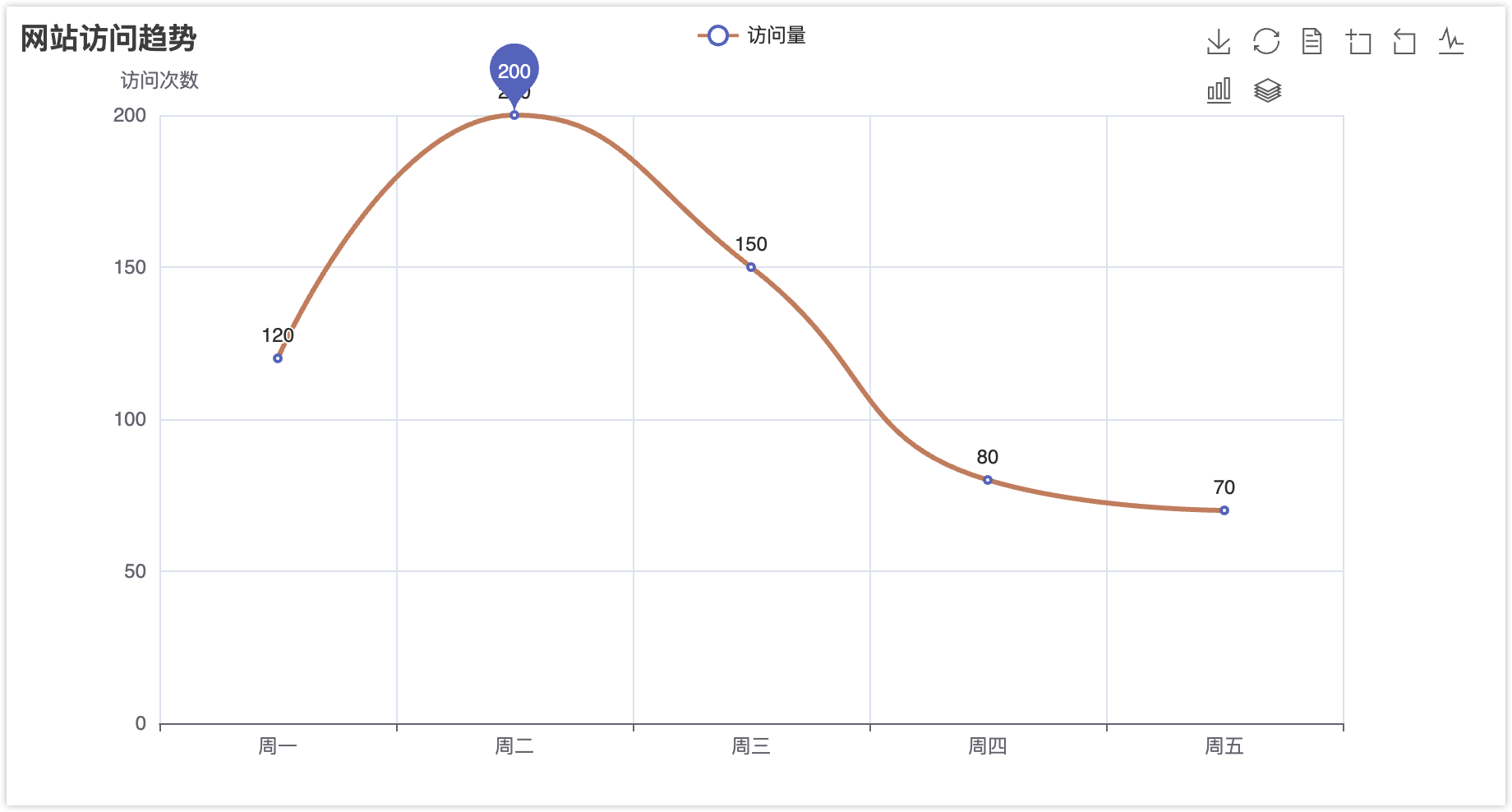
接下来我们随便写一点数据,比如工作日的网站访问量,来生成一个折线图。
from pyecharts.charts import Line
from pyecharts import options as opts

# 数据准备
x_data = ["周一", "周二", "周三", "周四", "周五"]
y_data = [120, 200, 150, 80, 70]

# 构建图表
line = (
    Line()
    .add_xaxis(x_data)
    .add_yaxis(
        "访问量",
        y_data,
        is_smooth=True,
        markpoint_opts=opts.MarkPointOpts(data=[opts.MarkPointItem(type_="max")]),
        linestyle_opts=opts.LineStyleOpts(width=3, color="#d48265")
    )
    .set_global_opts(
        title_opts=opts.TitleOpts(title="网站访问趋势", pos_left="center"),
        yaxis_opts=opts.AxisOpts(name="访问次数"),
        toolbox_opts=opts.ToolboxOpts(is_show=True)
    )
)
line.render("website_trend.html")
生成文件可通过浏览器打开交互查看,支持缩放、数据点悬停提示等交互功能。
3. 基础图表示例
Note
Pyecharts库的官方文档提供了非常多的示例,我们挑选其中的常用图表做讲解,需要查看完整的文档内容请访问以下链接。
- • 传送门:https://gallery.pyecharts.org/#/README
3.1 折线图(Line)
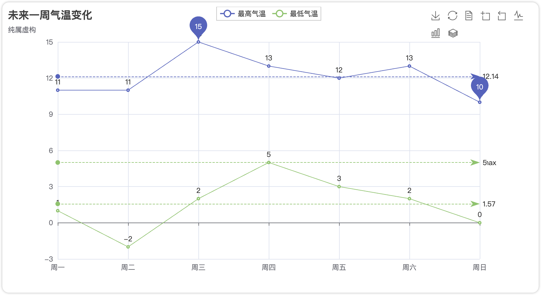
完整代码:
import pyecharts.options as opts
from pyecharts.charts import Line

week_name_list = ["周一", "周二", "周三", "周四", "周五", "周六", "周日"]
high_temperature = [11, 11, 15, 13, 12, 13, 10]
low_temperature = [1, -2, 2, 5, 3, 2, 0]


(
    Line()
    .add_xaxis(xaxis_data=week_name_list)
    .add_yaxis(
        series_name="最高气温",
        y_axis=high_temperature,
        markpoint_opts=opts.MarkPointOpts(
            data=[
                opts.MarkPointItem(type_="max", name="最大值"),
                opts.MarkPointItem(type_="min", name="最小值"),
            ]
        ),
        markline_opts=opts.MarkLineOpts(
            data=[opts.MarkLineItem(type_="average", name="平均值")]
        ),
    )
    .add_yaxis(
        series_name="最低气温",
        y_axis=low_temperature,
        markpoint_opts=opts.MarkPointOpts(
            data=[opts.MarkPointItem(value=-2, name="周最低", x=1, y=-1.5)]
        ),
        markline_opts=opts.MarkLineOpts(
            data=[
                opts.MarkLineItem(type_="average", name="平均值"),
                opts.MarkLineItem(symbol="none", x="90%", y="max"),
                opts.MarkLineItem(symbol="circle", type_="max", name="最高点"),
            ]
        ),
    )
    .set_global_opts(
        title_opts=opts.TitleOpts(title="未来一周气温变化", subtitle="纯属虚构"),
        tooltip_opts=opts.TooltipOpts(trigger="axis"),
        toolbox_opts=opts.ToolboxOpts(is_show=True),
        xaxis_opts=opts.AxisOpts(type_="category", boundary_gap=False),
    )
    .render("temperature.html")
)
3.2 柱状图(Bar)
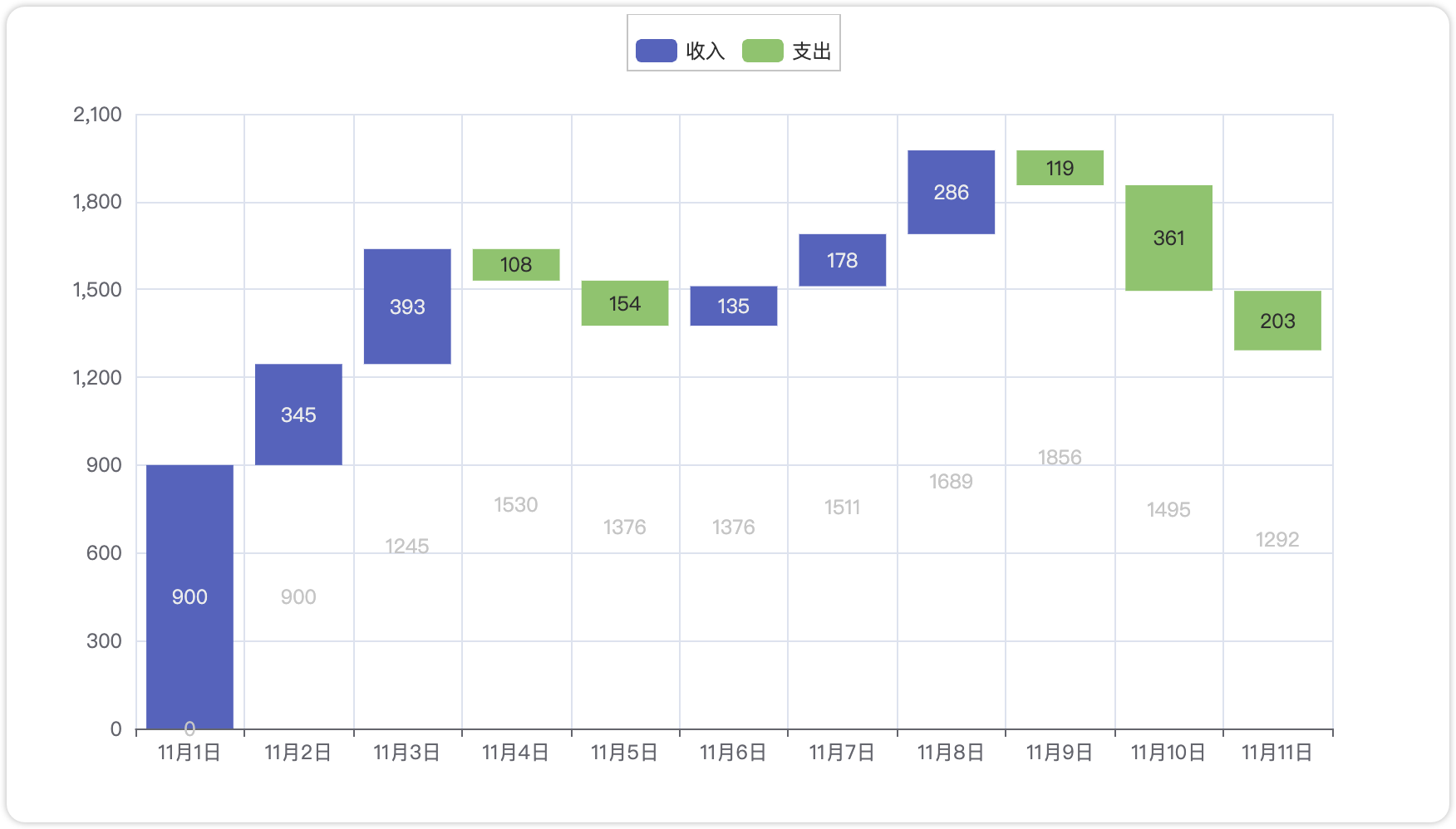
完整代码:
from pyecharts.charts import Bar
from pyecharts import options as opts

x_data = [f"11月{str(i)}日" for i in range(1, 12)]
y_total = [0, 900, 1245, 1530, 1376, 1376, 1511, 1689, 1856, 1495, 1292]
y_in = [900, 345, 393, "-", "-", 135, 178, 286, "-", "-", "-"]
y_out = ["-", "-", "-", 108, 154, "-", "-", "-", 119, 361, 203]


bar = (
    Bar()    .add_xaxis(xaxis_data=x_data)
    .add_yaxis(        series_name="",
        y_axis=y_total,
        stack="总量",
        itemstyle_opts=opts.ItemStyleOpts(color="rgba(0,0,0,0)"),
    )
    .add_yaxis(series_name="收入", y_axis=y_in, stack="总量")
    .add_yaxis(series_name="支出", y_axis=y_out, stack="总量")
    .set_global_opts(yaxis_opts=opts.AxisOpts(type_="value"))
    .render("bar_waterfall_plot.html")
)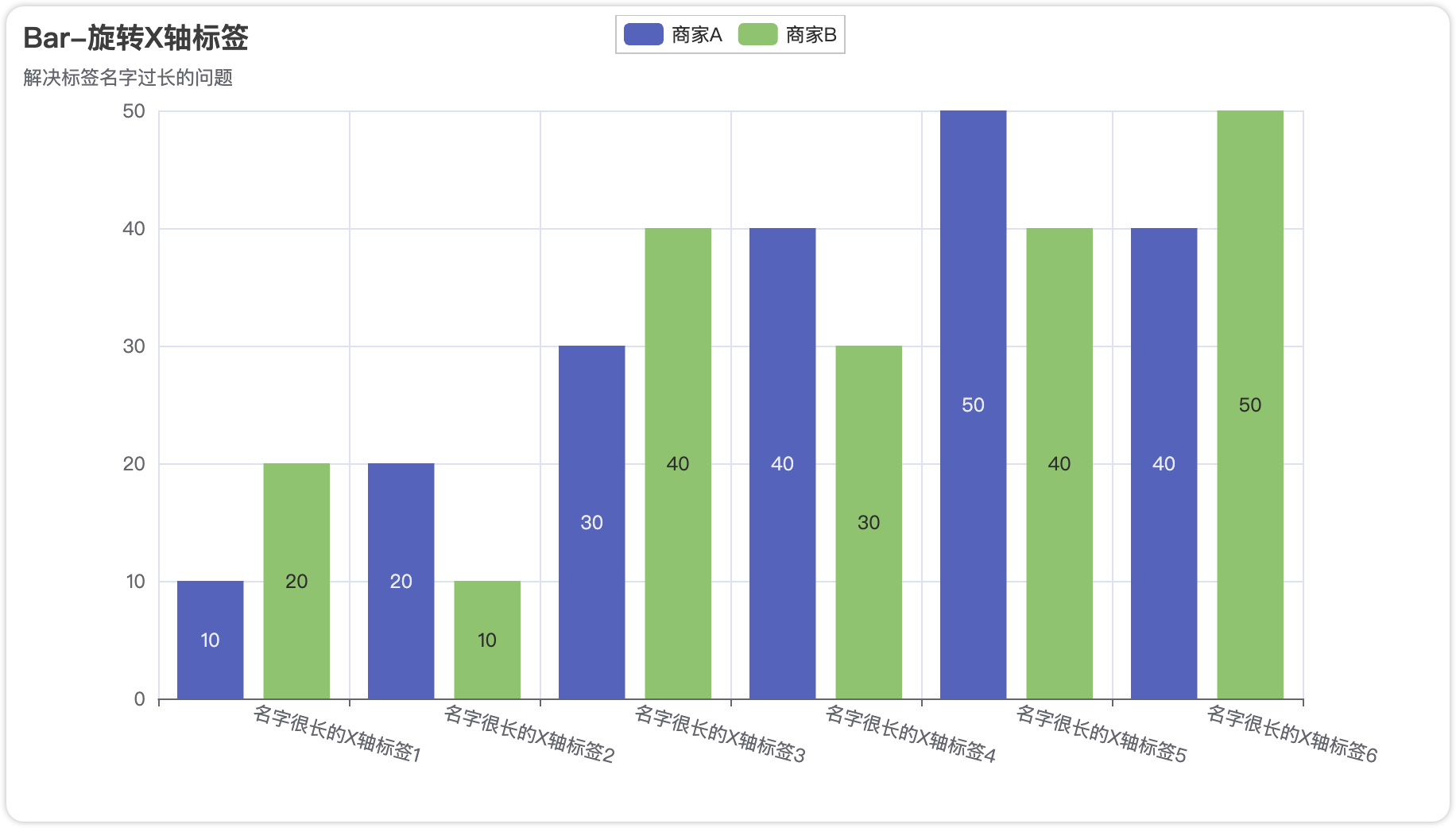
完整代码:
 from pyecharts import options as opts
 from pyecharts.charts import Bar
 c = (
    Bar()
    .add_xaxis(
    [
            "名字很长的X轴标签1",
            "名字很长的X轴标签2",
            "名字很长的X轴标签3",
            "名字很长的X轴标签4",
            "名字很长的X轴标签5",
            "名字很长的X轴标签6",
    ])
    .add_yaxis("商家A", [10, 20, 30, 40, 50, 40])
    .add_yaxis("商家B", [20, 10, 40, 30, 40, 50])
    .set_global_opts(
    xaxis_opts=opts.AxisOpts(axislabel_opts=opts.LabelOpts(rotate=-15)),
    title_opts=opts.TitleOpts(title="Bar-旋转X轴标签", subtitle="解决标签名字过长的问题"),
    )
    .render("bar_rotate_xaxis_label.html")
)
3.3 饼图
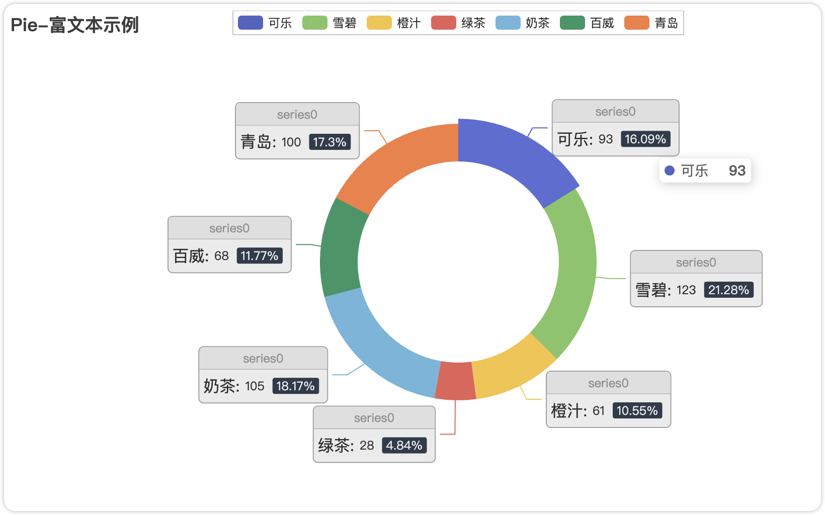
完整代码:
from pyecharts import options as opts
from pyecharts.charts import Pie
from pyecharts.faker import Faker

c = (
    Pie()
    .add(
        "",
        [list(z) for z in zip(Faker.choose(), Faker.values())],
        radius=["40%", "55%"],
        label_opts=opts.LabelOpts(
            position="outside",
            formatter="{a|{a}}{abg|}\n{hr|}\n {b|{b}: }{c}  {per|{d}%}  ",
            background_color="#eee",
            border_color="#aaa",
            border_width=1,
            border_radius=4,
            rich={
                "a": {"color": "#999", "lineHeight": 22, "align": "center"},
                "abg": {
                    "backgroundColor": "#e3e3e3",
                    "width": "100%",
                    "align": "right",
                    "height": 22,
                    "borderRadius": [4, 4, 0, 0],
                },
                "hr": {
                    "borderColor": "#aaa",
                    "width": "100%",
                    "borderWidth": 0.5,
                    "height": 0,
                },
                "b": {"fontSize": 16, "lineHeight": 33},
                "per": {
                    "color": "#eee",
                    "backgroundColor": "#334455",
                    "padding": [2, 4],
                    "borderRadius": 2,
                },
            },
        ),
    )
    .set_global_opts(title_opts=opts.TitleOpts(title="Pie-富文本示例"))
    .render("pie_rich_label.html")
)
3.4 雷达图

完整代码:
from pyecharts import options as opts
from pyecharts.charts import Radar

v1 = [[4300, 10000, 28000, 35000, 50000, 19000]]
v2 = [[5000, 14000, 28000, 31000, 42000, 21000]]
c = (
    Radar()
    .add_schema(
        schema=[
            opts.RadarIndicatorItem(name="销售", max_=6500),
            opts.RadarIndicatorItem(name="管理", max_=16000),
            opts.RadarIndicatorItem(name="信息技术", max_=30000),
            opts.RadarIndicatorItem(name="客服", max_=38000),
            opts.RadarIndicatorItem(name="研发", max_=52000),
            opts.RadarIndicatorItem(name="市场", max_=25000),
        ]
    )
    .add("预算分配", v1)
    .add("实际开销", v2)
    .set_series_opts(label_opts=opts.LabelOpts(is_show=False))
    .set_global_opts(
        legend_opts=opts.LegendOpts(selected_mode="single"),
        title_opts=opts.TitleOpts(title="Radar-单例模式"),
    )
    .render("radar_selected_mode.html")
)
3.5 K线图
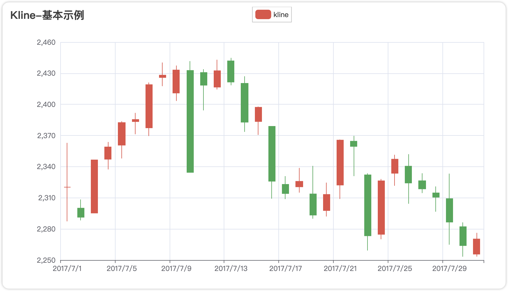
完整代码:
from pyecharts import options as opts
from pyecharts.charts import Kline

data = [
    [2320.26, 2320.26, 2287.3, 2362.94],
    [2300, 2291.3, 2288.26, 2308.38],
    [2295.35, 2346.5, 2295.35, 2345.92],
    [2347.22, 2358.98, 2337.35, 2363.8],
    [2360.75, 2382.48, 2347.89, 2383.76],
    [2383.43, 2385.42, 2371.23, 2391.82],
    [2377.41, 2419.02, 2369.57, 2421.15],
    [2425.92, 2428.15, 2417.58, 2440.38],
    [2411, 2433.13, 2403.3, 2437.42],
    [2432.68, 2334.48, 2427.7, 2441.73],
    [2430.69, 2418.53, 2394.22, 2433.89],
    [2416.62, 2432.4, 2414.4, 2443.03],
    [2441.91, 2421.56, 2418.43, 2444.8],
    [2420.26, 2382.91, 2373.53, 2427.07],
    [2383.49, 2397.18, 2370.61, 2397.94],
    [2378.82, 2325.95, 2309.17, 2378.82],
    [2322.94, 2314.16, 2308.76, 2330.88],
    [2320.62, 2325.82, 2315.01, 2338.78],
    [2313.74, 2293.34, 2289.89, 2340.71],
    [2297.77, 2313.22, 2292.03, 2324.63],
    [2322.32, 2365.59, 2308.92, 2366.16],
    [2364.54, 2359.51, 2330.86, 2369.65],
    [2332.08, 2273.4, 2259.25, 2333.54],
    [2274.81, 2326.31, 2270.1, 2328.14],
    [2333.61, 2347.18, 2321.6, 2351.44],
    [2340.44, 2324.29, 2304.27, 2352.02],
    [2326.42, 2318.61, 2314.59, 2333.67],
    [2314.68, 2310.59, 2296.58, 2320.96],
    [2309.16, 2286.6, 2264.83, 2333.29],
    [2282.17, 2263.97, 2253.25, 2286.33],
    [2255.77, 2270.28, 2253.31, 2276.22],
]


c = (
    Kline()
    .add_xaxis(["2017/7/{}".format(i + 1) for i in range(31)])
    .add_yaxis("kline", data)
    .set_global_opts(
        yaxis_opts=opts.AxisOpts(is_scale=True),
        xaxis_opts=opts.AxisOpts(is_scale=True),
        title_opts=opts.TitleOpts(title="Kline-基本示例"),
    )
    .render("kline_base.html")
)
4.可视化进阶
4.1 组件
Pyecharts库提供了大量的组件,我们可以自由选择实现更加高级的效果。
4.1.1 Tab 组件:多图表标签切换
适用场景:需在同一页面展示不同类型图表(如柱状图与折线图对比),通过标签切换实现空间复用
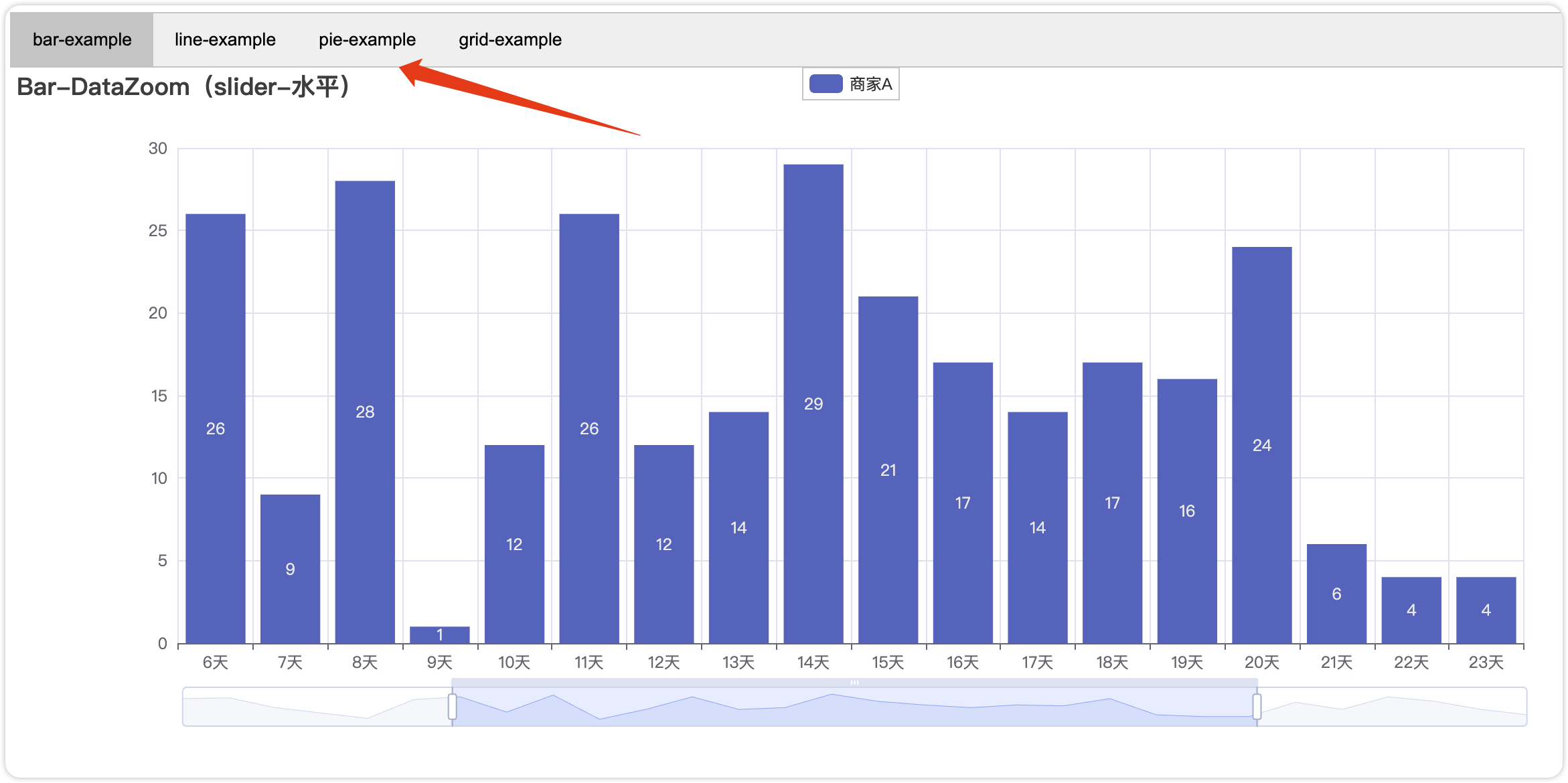
实现方法:
from pyecharts.charts import Tab, Bar, Line

tab = Tab()
# 创建柱状图
bar = Bar().add_xaxis(["A", "B", "C"]).add_yaxis("销量", [10, 20, 30])
# 创建折线图
line = Line().add_xaxis(["A", "B", "C"]).add_yaxis("增长率", [0.05, 0.1, 0.8])
# 组合到Tab
tab.add(bar, "销售趋势")
tab.add(line, "增长分析")
tab.render("tab_demo.html")特性:
- • 支持无限添加子图表
- • 每个标签页独立配置标题和样式
- • 通过
tab.add(图表对象, 标签名称)动态扩展
4.1.2 Page 组件:多图表垂直布局
适用场景:需将多个图表纵向排列形成完整报告(如数据看板)
实现方法:
from pyecharts.charts import Page, Bar, Pie

page = Page(layout=Page.SimpleLayoutType)  # 简单纵向布局
# 添加多个图表
page.add(
    Bar().add_xaxis(...),
    Pie().add(...),
    Line().add(...)
)
page.render("report.html")
布局模式:
| 布局类型 | 特性 | 适用场景 |
SimpleLayoutType | 默认纵向排列,宽度100% | 简单报告 |
DraggableLayoutType | 允许用户拖拽调整位置 | 交互式看板 |
CustomLayoutType | 通过 pos_left, pos_top 自定义坐标 | 复杂排版需求 |
4.1.3 Grid 组件:混合图表叠加
适用场景:需在同一坐标系叠加不同图表(如柱状图+折线图组合)
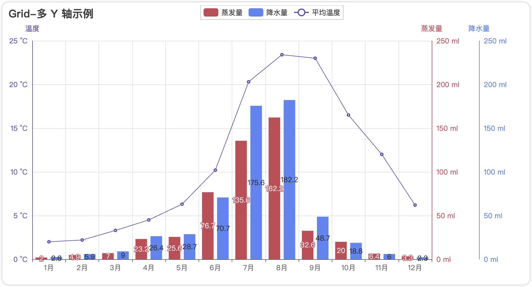
实现方法:
from pyecharts.charts import Grid, Bar, Line

grid = Grid()
# 创建基础图表
bar = Bar().add_yaxis(...)
line = Line().add_yaxis(...)
# 叠加组合
grid.add(bar, grid_opts=opts.GridOpts(pos_left="5%"))
grid.add(line, grid_opts=opts.GridOpts(pos_right="5%"))叠加策略:
通过 Grid 控制叠加位置和比例:
grid.add(bar, grid_opts=opts.GridOpts(pos_bottom="60%"))  # 占据上半部分
grid.add(line, grid_opts=opts.GridOpts(pos_top="60%"))    # 占据下半部分
完整代码示例:
from pyecharts import options as opts
from pyecharts.charts import Bar, Grid, Line

x_data = ["{}月".format(i) for i in range(1, 13)]
bar = (
    Bar()
    .add_xaxis(x_data)
    .add_yaxis(
        "蒸发量",
        [2.0, 4.9, 7.0, 23.2, 25.6, 76.7, 135.6, 162.2, 32.6, 20.0, 6.4, 3.3],
        yaxis_index=0,
        color="#d14a61",
    )
    .add_yaxis(
        "降水量",
        [2.6, 5.9, 9.0, 26.4, 28.7, 70.7, 175.6, 182.2, 48.7, 18.8, 6.0, 2.3],
        yaxis_index=1,
        color="#5793f3",
    )
    .extend_axis(
        yaxis=opts.AxisOpts(
            name="蒸发量",
            type_="value",
            min_=0,
            max_=250,
            position="right",
            axisline_opts=opts.AxisLineOpts(
                linestyle_opts=opts.LineStyleOpts(color="#d14a61")
            ),
            axislabel_opts=opts.LabelOpts(formatter="{value} ml"),
        )
    )
    .extend_axis(
        yaxis=opts.AxisOpts(
            type_="value",
            name="温度",
            min_=0,
            max_=25,
            position="left",
            axisline_opts=opts.AxisLineOpts(
                linestyle_opts=opts.LineStyleOpts(color="#675bba")
            ),
            axislabel_opts=opts.LabelOpts(formatter="{value} °C"),
            splitline_opts=opts.SplitLineOpts(
                is_show=True, linestyle_opts=opts.LineStyleOpts(opacity=1)
            ),
        )
    )
    .set_global_opts(
        yaxis_opts=opts.AxisOpts(
            name="降水量",
            min_=0,
            max_=250,
            position="right",
            offset=80,
            axisline_opts=opts.AxisLineOpts(
                linestyle_opts=opts.LineStyleOpts(color="#5793f3")
            ),
            axislabel_opts=opts.LabelOpts(formatter="{value} ml"),
        ),
        title_opts=opts.TitleOpts(title="Grid-多 Y 轴示例"),
        tooltip_opts=opts.TooltipOpts(trigger="axis", axis_pointer_type="cross"),
    )
)

line = (
    Line()
    .add_xaxis(x_data)
    .add_yaxis(
        "平均温度",
        [2.0, 2.2, 3.3, 4.5, 6.3, 10.2, 20.3, 23.4, 23.0, 16.5, 12.0, 6.2],
        yaxis_index=2,
        color="#675bba",
        label_opts=opts.LabelOpts(is_show=False),
    )
)

bar.overlap(line)
grid = Grid()
grid.add(bar, opts.GridOpts(pos_left="5%", pos_right="20%"), is_control_axis_index=True)
grid.render("grid_multi_yaxis.html")
4.1.4 Timeline 组件:动态时间轴
适用场景:展示时间序列数据的动态变化,点击时间即可切换数据(如年度销售趋势演变)
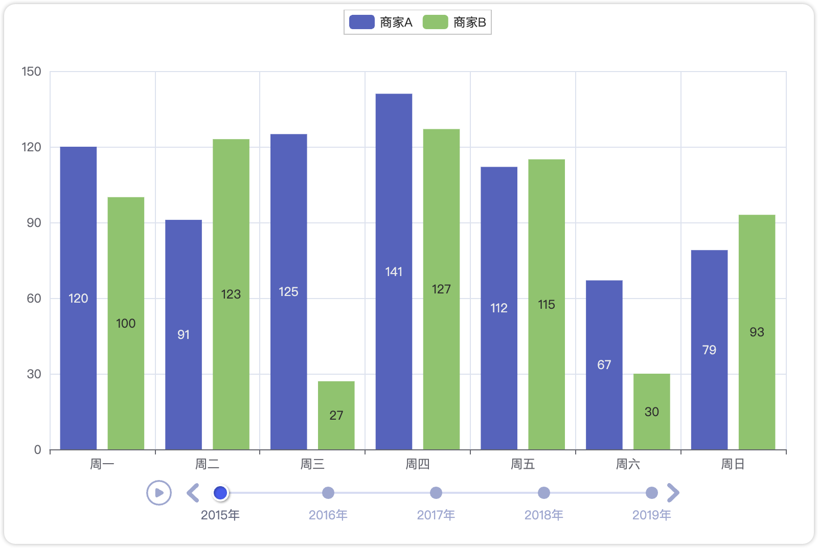
代码实现:
from pyecharts import options as opts
from pyecharts.charts import Bar, Timeline
from pyecharts.faker import Faker

x = Faker.choose()
tl = Timeline()
for i in range(2015, 2020):
    bar = (
        Bar()
        .add_xaxis(x)
        .add_yaxis("商家A", Faker.values())
        .add_yaxis("商家B", Faker.values())
        .set_global_opts(title_opts=opts.TitleOpts("某商店{}年营业额".format(i)))
    )
    tl.add(bar, "{}年".format(i))
tl.render("timeline_bar.html")
4.1.5 Overlap组件:同坐标系叠加
Overlap 组件用于在同一坐标系中叠加多个不同类型的图表(如折线图 + 柱状图、散点图 + 热力图),实现多维度数据的对比分析。
适用场景 :与 Grid 布局不同,Overlap 要求所有图表共享相同的坐标系,适合需要直接对比数据趋势的场景
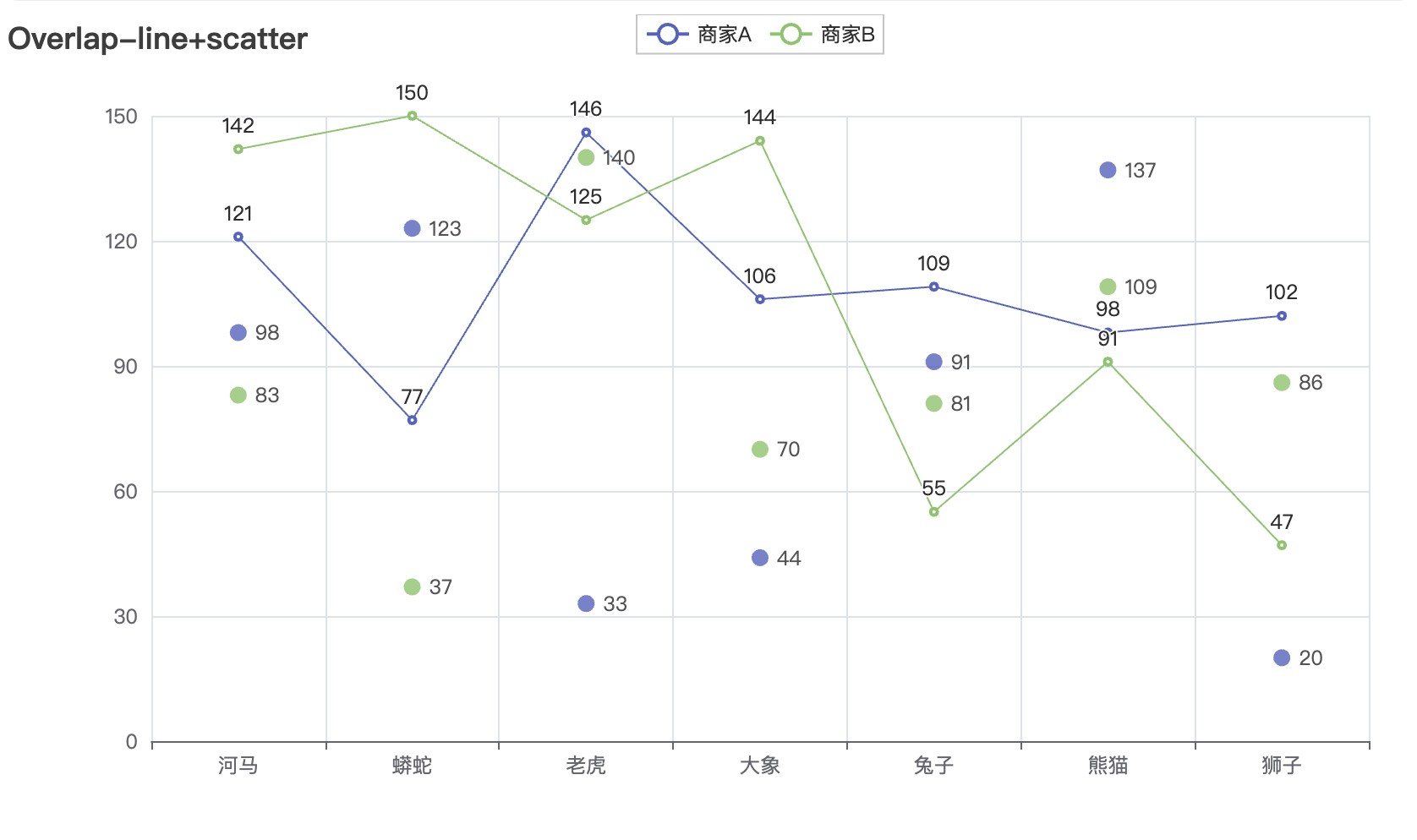
实现方法:
from pyecharts.charts import Line, Bar, Overlap

# 创建基础图表
line = Line().add_xaxis(x_data).add_yaxis(...)
bar = Bar().add_xaxis(x_data).add_yaxis(...)

# 使用 Overlap 叠加
overlap = Overlap()
overlap.add(line)          # 添加第一个图表作为基础
overlap.add(bar)           # 叠加第二个图表
overlap.render("overlap.html")
完整代码:
from pyecharts import options as opts
from pyecharts.charts import Line, Scatter
from pyecharts.faker import Faker

x = Faker.choose()
line = (
    Line()
    .add_xaxis(x)
    .add_yaxis("商家A", Faker.values())
    .add_yaxis("商家B", Faker.values())
    .set_global_opts(title_opts=opts.TitleOpts(title="Overlap-line+scatter"))
)
scatter = (
    Scatter()
    .add_xaxis(x)
    .add_yaxis("商家A", Faker.values())
    .add_yaxis("商家B", Faker.values())
)
line.overlap(scatter)
line.render("overlap_line_scatter.html")组合策略选择指南:
| 组合方式 | 优势 | 局限性 | 典型应用场景 |
| Tab | 空间利用率高,支持复杂类型对比 | 无法同时展示所有图表 | 多维度数据分析报告 |
| Page | 布局规整,适合打印输出 | 交互性较弱 | PDF报告生成 |
| Grid | 支持精确坐标控制,可实现复杂布局 | 配置参数较多 | 数据大屏开发 |
| Timeline | 动态展示时间序列变化 | 数据量过大时性能下降 | 历史数据趋势演示 |
| Overlap | 快速实现简单图表叠加 | 坐标系类型必须一致 | 指标对比分析 |
4.2 地图可视化
Pyecharts库也可以很方便的调用地图库来实现数据展示,只需要引用其中的Map库即可。
省市级数据展示:
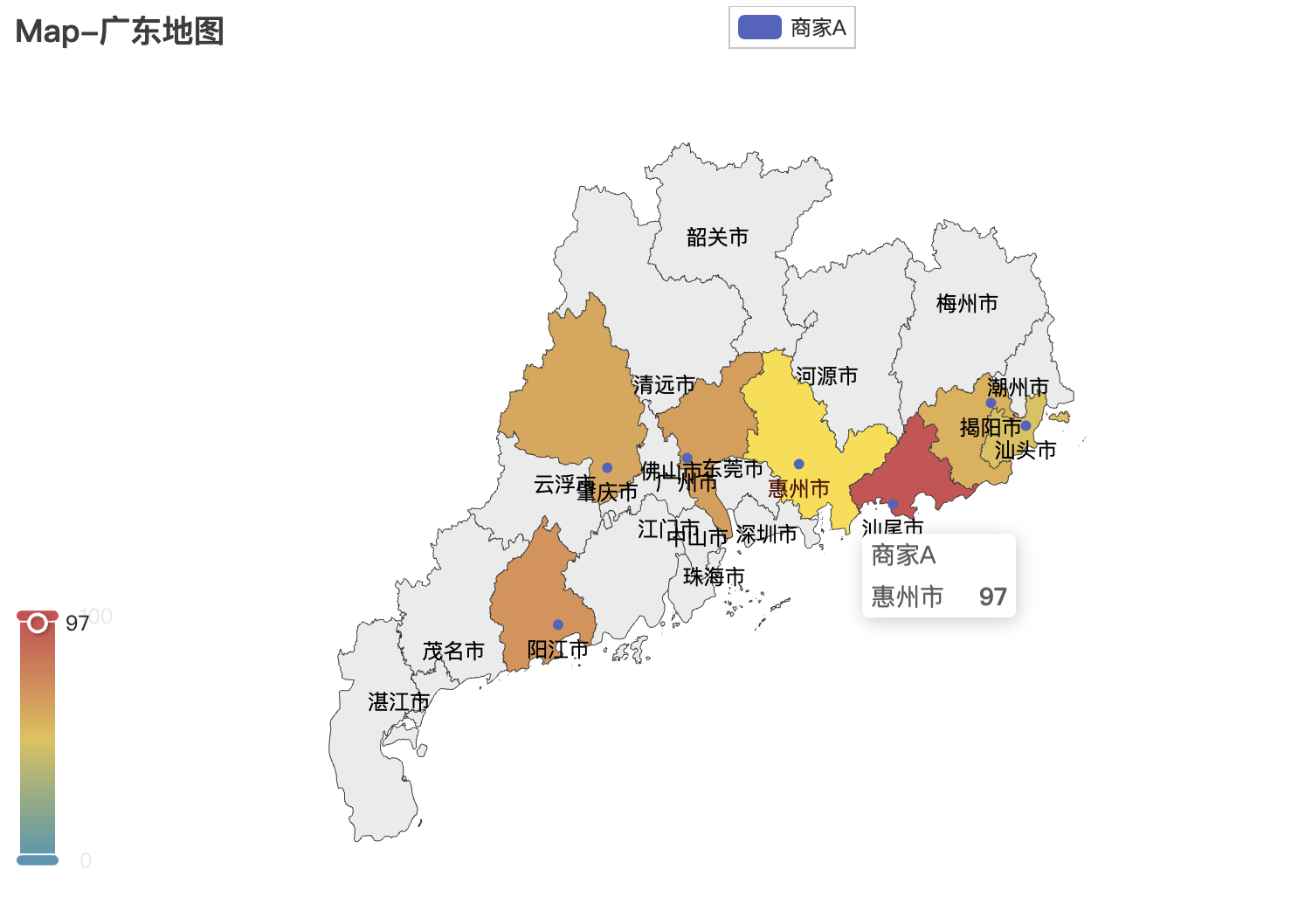
完整代码:
from pyecharts import options as opts
from pyecharts.charts import Map
from pyecharts.faker import Faker

c = (
    Map()
    .add("商家A", [list(z) for z in zip(Faker.guangdong_city, Faker.values())], "广东")
    .set_global_opts(
        title_opts=opts.TitleOpts(title="Map-广东地图"), visualmap_opts=opts.VisualMapOpts()
    )
    .render("map_guangdong.html")
)
国家级:
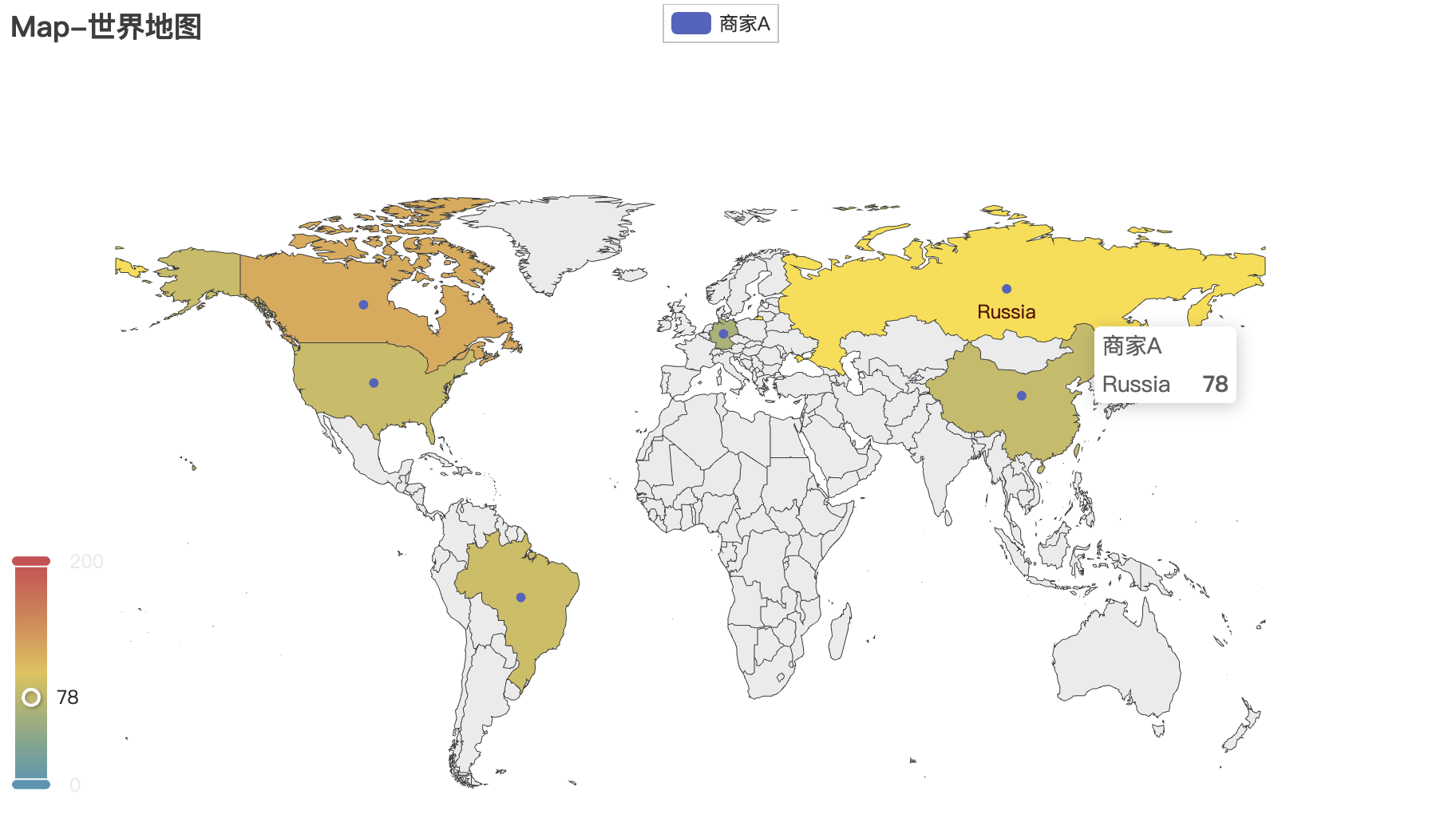
修改Map中的主要参数即可更换地图
Map()
.add("商家A", [list(z) for z in zip(Faker.guangdong_city, Faker.values())], "广东") 可选参数:"china-cities" "china" "城市名" "world"等。
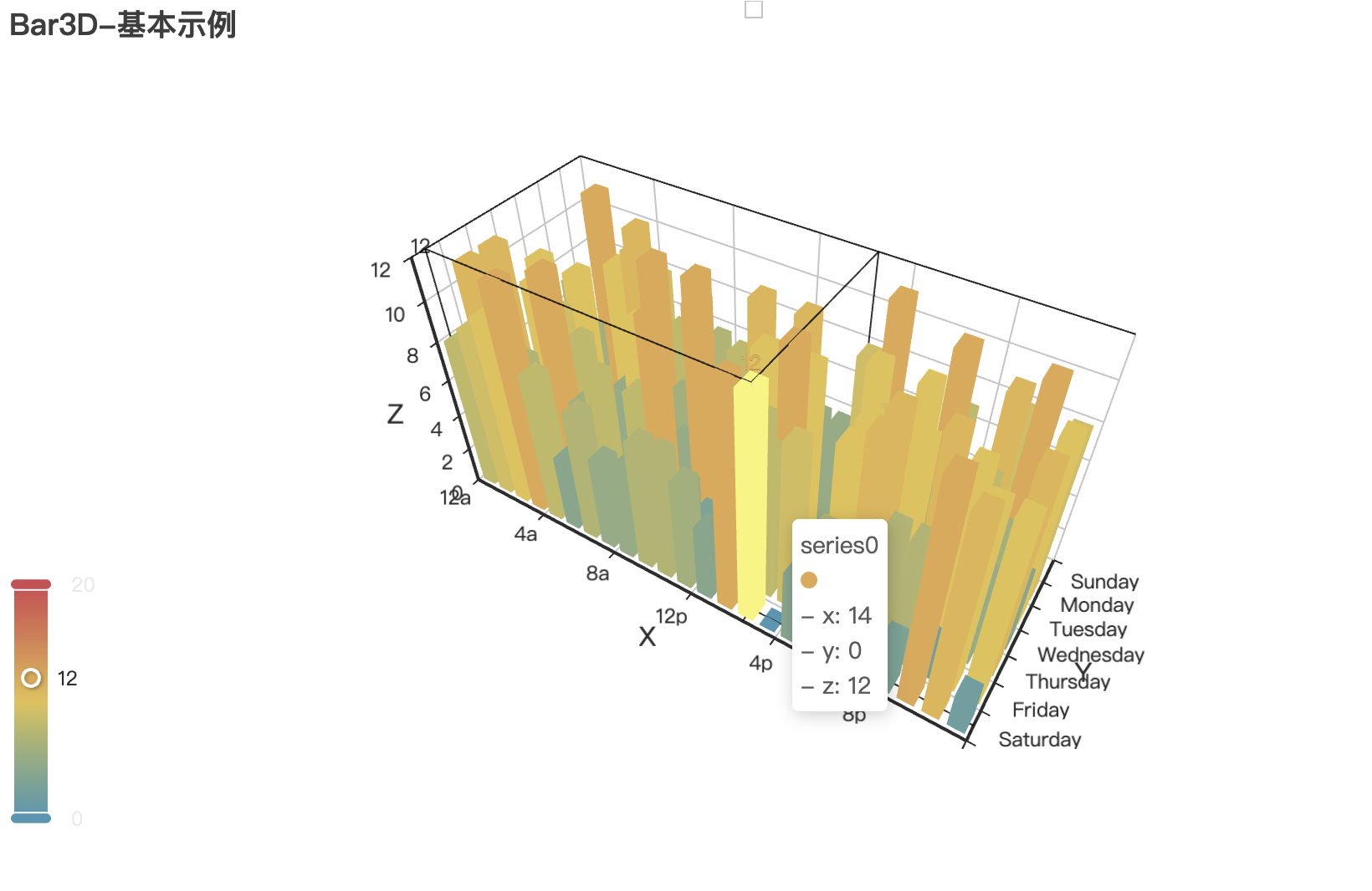
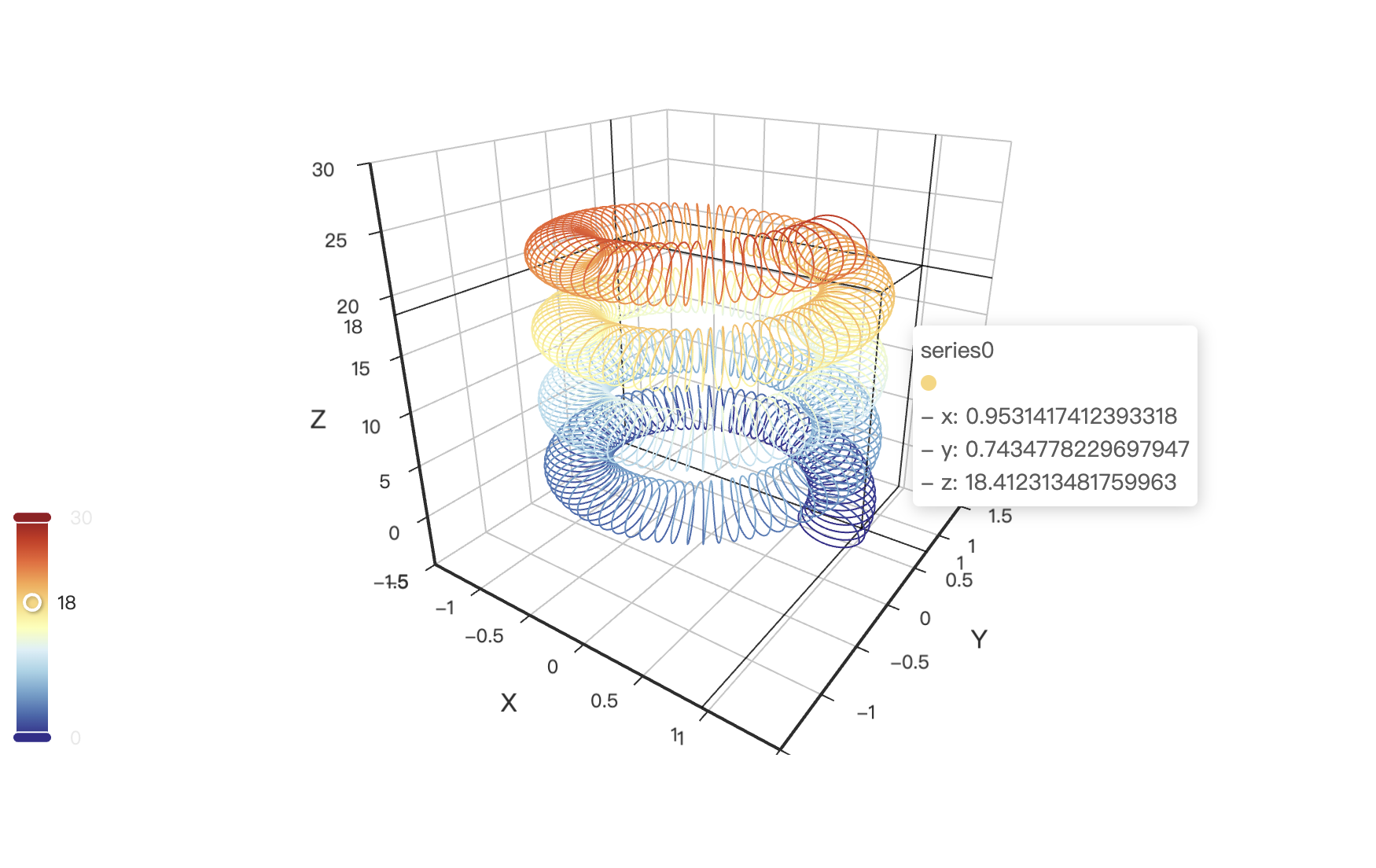
4.3 3D 图表
Pyecharts 提供丰富的 3D 可视化能力,可以用鼠标直接拖动,缩放、查看,非常好用!
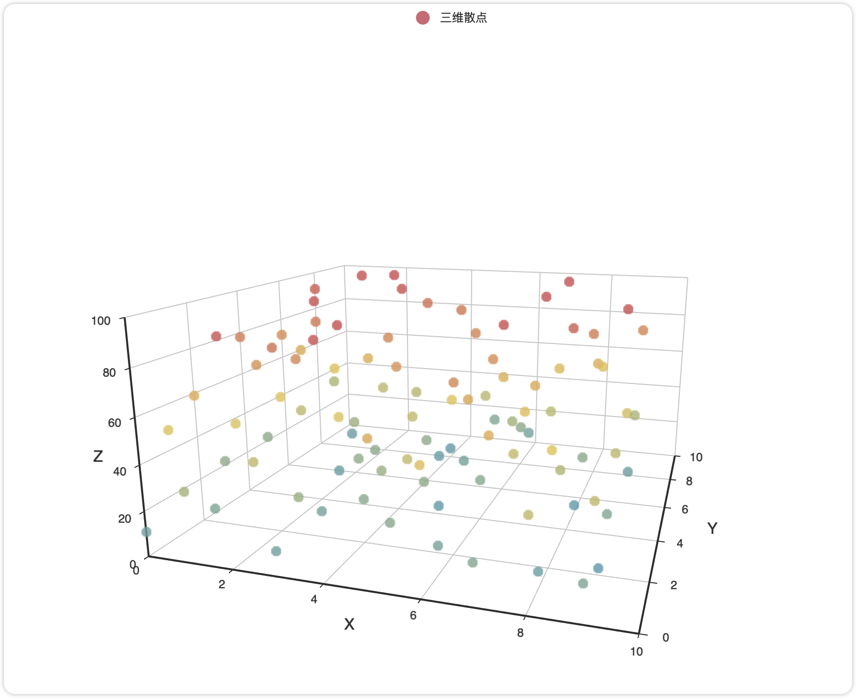
三维散点图代码:
from pyecharts.charts import Scatter3D, Bar3D, Surface3D  # 按需导入
from pyecharts import options as opts
from pyecharts.faker import Faker  # 内置测试数据

# 生成三维数据 (示例)
data = [[x, y, random.randint(0, 100)] for x in range(10) for y in range(10)]

# 初始化图表对象
chart = Scatter3D(init_opts=opts.InitOpts(width="1200px", height="800px"))

# 添加数据与配置
chart.add(
    series_name="三维散点",
    data=data,
    grid3d_opts=opts.Grid3DOpts(width=200, depth=200),  # 调整坐标系尺寸
    itemstyle_opts=opts.ItemStyleOpts(color="#d14a61")  # 自定义颜色
)

# 全局配置
chart.set_global_opts(
    title_opts=opts.TitleOpts(title="3D 散点图示例"),
    visualmap_opts=opts.VisualMapOpts(max_=100)  # 颜色映射范围
)

# 渲染输出
chart.render("3d_scatter.html")  # 或 chart.render_notebook() 在 Jupyter 中显示
功能配置:
- • 动态旋转
通过Grid3DOpts实现自动旋转效果:
chart.add(..., grid3d_opts=opts.Grid3DOpts(
    is_rotate=True,        # 启用自动旋转
    rotate_speed=10,       # 旋转速度(值越大越慢)
    rotate_sensitivity=1   # 鼠标拖拽灵敏度
))- • 多轴联动
双 Y 轴场景需扩展坐标系:
bar3d = Bar3D().extend_axis(
    yaxis=opts.Axis3DOpts(type_="value", name="次坐标轴")
)
5. 小结
Pyecharts 凭借其丰富的可视化类型和灵活的配置选项,已成为 Python 数据可视化生态中的重要工具。本文提供了从基础图表到复杂交互的一些实现方法,但受篇幅限制,无法面面俱到,还有数据整合、Flask整合等内容本文尚未提到,建议结合官方文档深入探索更多高级功能。
附录:资源推荐
- 📎 官方示例库:https://gallery.pyecharts.org
- 📎 官方文档:https://pyecharts.org/#/zh-cn/intro
- 📎 ECharts 配置项手册:https://echarts.apache.org/zh/option.html